Snacks To Entertain

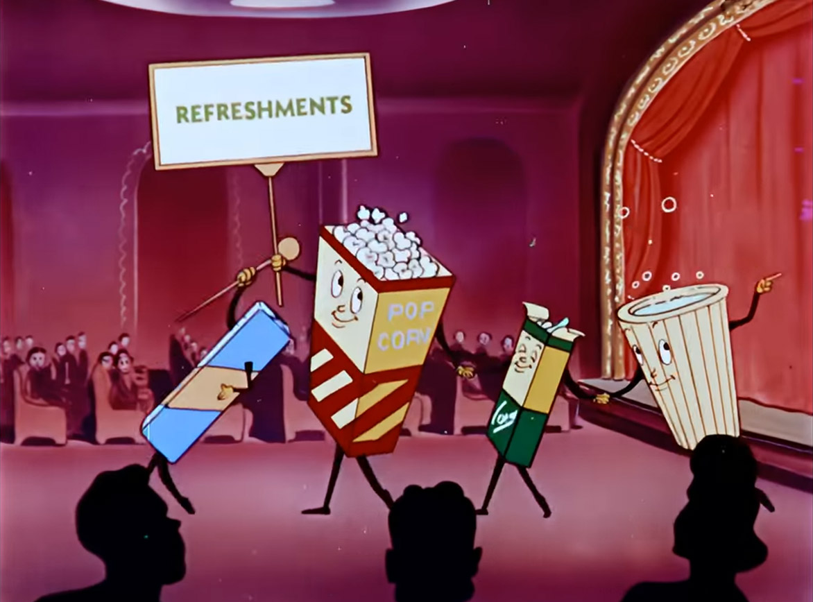
From movie theaters with their classics (and combos) to streaming content, snacks and entertainment have always gone hand in hand. And just like the variety of streaming options, you have a variety of salty and/or sweet snacks when it comes to the grocery store aisles. If you head down the salty chip aisle, it’s looking HOT! With spicy options everywhere – “Hot This” and “Extreme That” - you might think snack choices would become more limiting. Yet food brands have found a workaround. Brands are no longer confined to a single color. In fact, the more colors, the better. You don’t want to fit yourself into one box (or bag). Branding colors have expanded along with their products.
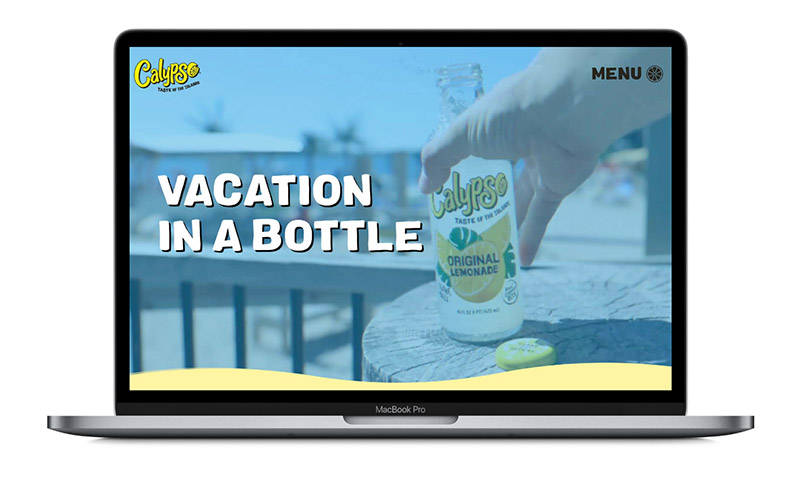
Yet, you see brands like Calypso Lemonades and Poppi choosing all the color options. The science might not be catching up to the quick brand trends. Or maybe the trends are moving too fast for the science to catch up. Quick thinking and action are going to be what keeps the best brands on top.
Quick thinking and action only work if the branding is accessible. If you have a strong brand and great work, make sure your website is just as hard-working and has digital accessibility. With any great website refresh, you should be considering the following:
- The content and product(s) reflect the brand voice
- Expand your video and image library
- Incorporate social content

A hard-working website needs variety too. People like options. Not just because it offers them the choice in how they access information (visual vs kinesthetic learning), but because it broadens the audience and reach. The key to strong branding is its ability to connect with multiple audiences. When it comes to digital design and development, B+L thinks about the content AND the audience. Trends might get you noticed, but if your brand is not accessible or doesn’t meet WCAG requirements, then your audience won’t see it.
“Yellow Can Make You Happy”
The “dark yellow problem” is the perfect example of digital accessibility. That’s not to say that if your brand uses yellow, it can’t be incorporated. We can broaden its capabilities to reach your maximum audience. Instead of throwing the whole color palette on a site, its uses could be attention-grabbing. B+L’s own brand uses orange to highlight important elements.
Colors might have been shown to emote certain meanings, but ultimately, it’s up to the brand to use them and how. When you can use all the colors of the rainbow, it only works when you use them in an eye-catching and cohesive way. We’re no longer restricted to what offerings are at the movie theatre or by a Brands color palette.

