

Is it time for a logo refresh?

When to consider a redesign:
1. Does your logo look outdated?
In the world of design and consumerism, a book (aka brand) will be judged by its cover (aka logo). For instance, looking at a shelf of products based on logo and packaging alone, you would probably be more drawn to the product that you find the most visually appealing. And although there is strength in longevity and recognizability, consumers may view an older logo as a brand that is losing its relevancy and appeal compared to the next new and shiny design. However, it’s important to balance the traditional and the trendy to create something that feels fresh and reignites brand interest, while not seeming like a fleeting design that will need to be reworked in a year.
2. Has your competition changed?
A refreshed logo reflects that your brand is staying current and excelling in its industry, as well as capturing attention and setting you apart from the rest in a fast-paced marketing age where new products and brands practically appear overnight. The last thing you want for your brand is for it to get lost in a sea of competitors who appear to outshine you.
3. Has your audience changed?
If your audience has changed, or you’re hoping to target a new demographic, a logo refresh can be a means of appealing to different groups. For example, a more modern and fresher look can help connect with a younger consumer base, while a more traditional and nostalgic look can speak to an older audience.
4. Has your business expanded or changed focus?
Ensuring your logo accurately represents your company and its core offerings is essential, especially if you have recently merged, grown exponentially or added a new line of products. Big brands often pursue logo refreshes to signal a shift in their identity and to accompany larger brand transformations.
5. Is your logo easy to identify?
Digital design and technology are always evolving, so improvements can (and should) be made from time to time to ensure optimal scalability, for both print and digital formats. A logo should be just as readable on a large billboard as it is on a social media avatar.
6. Does your logo have meaning and is it memorable?
A nice-looking logo does nothing for your brand if there isn’t true meaning behind it. Furthermore, a logo with a misleading meaning can be equally as detrimental, and if people struggle to recognize your logo or confuse it with others, it’s not doing its job.
If any of the questions above are resonating for you, a redesign might be in your brand’s best interest. What could a logo refresh look like, you ask? We’ve gathered a handful of examples below. In recent years, the biggest trends driving logo redesigns are a shift toward modernization and simplicity, featuring flat, bold designs, removal of intricate, dated elements, and focusing on clarity and uniformity.
Burger King overhauled their logo (along with packaging, menus, decor and color palette) in 2021 with a bold, playful design that portrays a modern take on their original 1969 logo. They opted for a flatter look, a substantial shift from the glossy, three-dimensional feel of the previous logo.

Amazon refreshed their logo in 2025 (for the first time in two decades) to reflect a friendlier, warm tone, introduce a new global typeface and create a unified design system for their 50+ sub-brands.
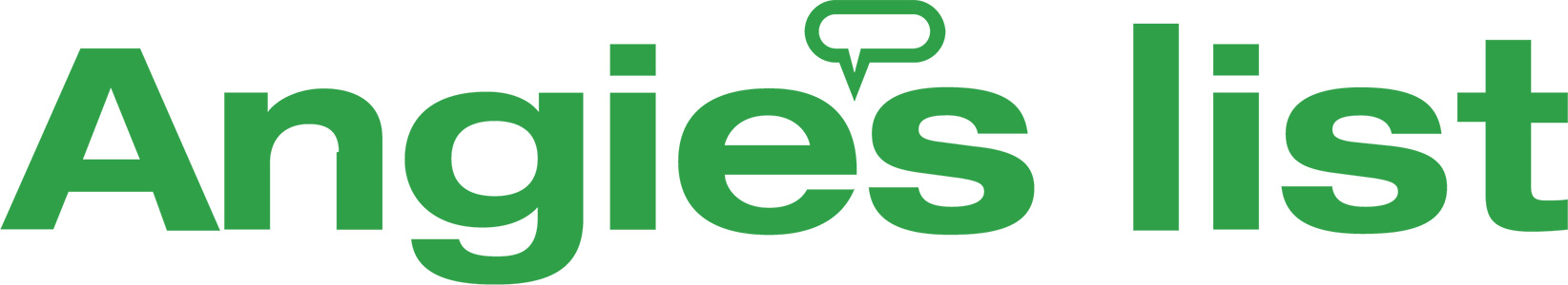
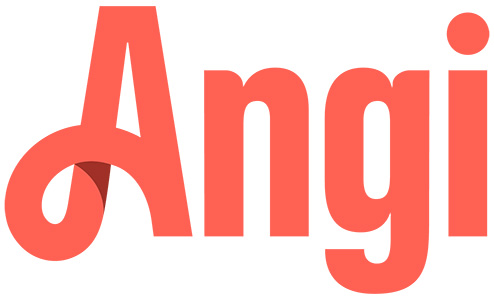
Angi, formerly Angi’s List, also pursued a logo redesign after 25 years in 2021, motivated by a shift away from the “list” aspect of their service and using bold, rounded letterforms in a vibrant coral color to portray home, warmth and approachability.
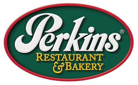
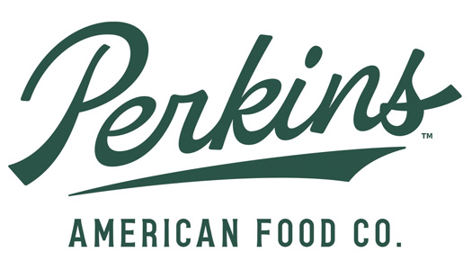
Perkins’ 2024 logo redesign signals its growth and broader menu offering with a modernized look, updating colors and using a cleaner font.
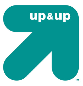
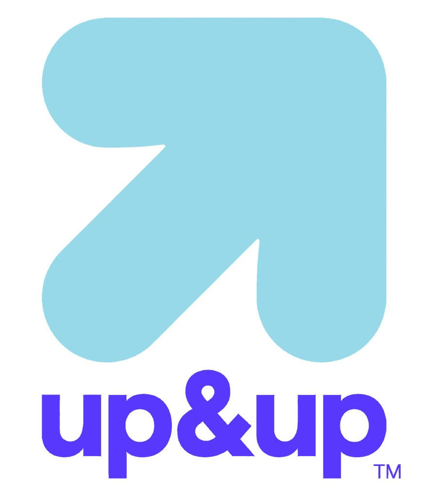
Target unveiled a refresh of their Up&Up brand logo and packaging in 2025, opting for a cleaner, color-forward design that matches competitor trends.
In our latest logo project, Boelter + Lincoln carried out a redesign for Eagle River, Wisconsin, which hadn’t undergone a major logo refresh in at least 20 years. Our approach was to evolve their logo to be cleaner and modernized, more scalable across digital platforms, and complement existing brand assets, such as a custom typeface. It was essential to maintain the core integrity and recognizability of Eagle River’s established logo, while infusing it with new energy to appeal to younger target audiences.
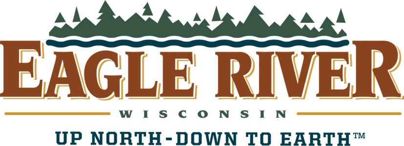
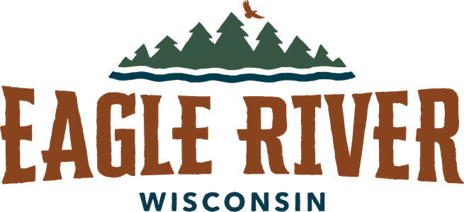
The simplification of typefaces and graphics, removal of outlines, incorporation of organic, streamlined shapes and subtle textured edges all contribute to achieving these goals.
Evolutions in logo design directly correlate with changes in society, technology, and coming generations. Each of these factors influence our popular culture, and therefore our perceptions and what appeals to us most. As a result of this cycle, new design trends are created, and the overall standards are raised yet again. Interested in how Boelter + Lincoln can help your branding and logo design reach their full potential? Let’s talk!