

Repositioning Brand USA

A minor font change? Hardly.
In branding, some of the most consequential decisions are often the quietest ones. A typeface. A color palette. A material choice. A grid system underlying a layout. These subtle decisions rarely announce themselves, yet they shape how an organization is perceived.
Governments, perhaps more than any other institution or business, demonstrate this dynamic at a massive scale. Their design decisions aren’t intended to influence consumer behavior; they aim to influence all of us, to shape how citizens feel about their place in the world. Recent federal shifts in visual language made by the second Trump administration offer a useful case study in how design can signal values, continuity and authority.
Typefaces as Positioning
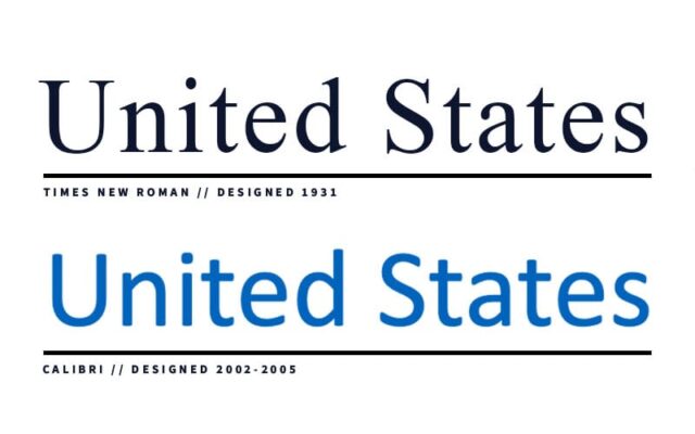
Just last month, the State Department announced the return of Times New Roman, abandoning Calibri, which had been adopted during the Biden administration as part of a broader modernization effort. On its face, the transition was a minor typographic change. From a brand perspective, it’s a repositioning.
Calibri, a contemporary, humanist, screen-optimized typeface, communicated efficient bureaucracy and present-day utility. Times New Roman, in contrast, carries associations of institutional gravity, tradition and academic seriousness owing to its 1930s newspaper publishing roots. Typefaces have the power to encode values. Neither is inherently “better,” but each frames the voice of the department differently.
For branding professionals, this is wholly familiar territory. Typeface selection is never neutral. It sets expectations about tone, authority, and audience—even before a single word is read.
Intentionality is Effective
The typeface change aligns with a wider federal emphasis on “classical” aesthetics, reflected in a handful of executive orders promoting traditional architectural styles and the Rococo embellishment of certain oblong, ovoid-shaped government offices. Classical design aesthetics have always been attractive to governments, and those seeking power. Columns, symmetry, gold accents, serif typefaces—these elements communicate stability, legitimacy, hierarchy and authority. They borrow from ancient Western empires and Enlightenment ideals to create a sense of inevitability: i.e., this institution has always been here, and it always will be.
Large, legacy organizations tend to lean on historical cues to reinforce trust and permanence. These decisions elevate the authority of an institution, for better or worse. While traditional design can inspire awe, it also has the power to alienate—especially in a pluralistic society where citizens come from many cultural, economic and historical backgrounds.
From a branding standpoint, the key insight is not whether this administration’s embrace of classicism is right or wrong, but whether it is strategic, and will be effective. By consistently emphasizing traditional aesthetics and their associated connotations, the Trump administration reinforces their desired values and identity across the federal government’s vast reach.
Historical Precedents
The United States government has long understood the value of coordinated, intentional design.
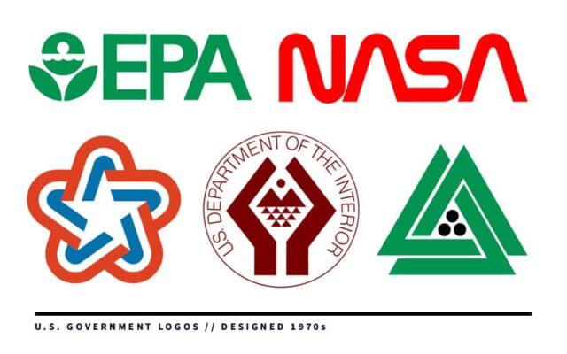
In the 1970s, the Nixon administration launched sweeping efforts to improve federal graphics and communications—realizing that it was simply good politics. With the help of leading designers, like Chermayeff & Geismar, federal agencies ranging from the National Park Service and the Environmental Protection Agency to NASA and PBS adopted cohesive visual identities, and the Bicentennial Commission adopted the single, greatest logo in American history (in this designer’s humble opinion).
The goal then was not an assertion of legitimacy and power, but clarity and effectiveness. Systematic, legible, and scalable, the modernist designs helped to unify agencies and improve public-facing communications. The effort was an early example of what brand strategists today would recognize as enterprise-level identity design.
Even earlier, President Theodore Roosevelt’s coinage beautification program treated everyday currency as an important touchpoint for national identity. By commissioning his friend and renowned sculptor Augustus Saint-Gaudens to redesign U.S. coinage, Roosevelt elevated design as a tool for reinforcing dignity and cohesion at the person-to-person level. The resulting coins, often regarded today as our country’s most beautiful, were classical in inspiration, but progressive in intent.
Across administrations, the throughline is clear: design is a powerful tool to express who the government believes it is, and how it wishes to be perceived.
Lessons for Us
Government design decisions remind us of something branding agencies know all too well—that every choice, however small, participates in the story an organization tells about itself. Typefaces, colors, layouts and materials don’t just support communication; they ARE communication. And when applied consistently at scale, they quietly define how authority, credibility and heritage are perceived.